This post is the seventh post in the “From Idea to Product Launch Series“
Series List:
- Introduction of series and the Chair Cane product developed
- What Product Idea Should I Develop?
- Do I need a Patent or Trademark?
- Should I Quit My job? (and side hustles I tried)
- How to Make a Prototype at Home
- How to get your Product Idea Manufactured
- Inventor Freight Forwarding for the First Time
- 5 Essential Ideas for Packaging a New Product
The short and quick guide to packaging requirements: it depends on what you are packaging and where you are selling. Click here for a glance at some official requirements.
- Make the packaging attractive and functional.
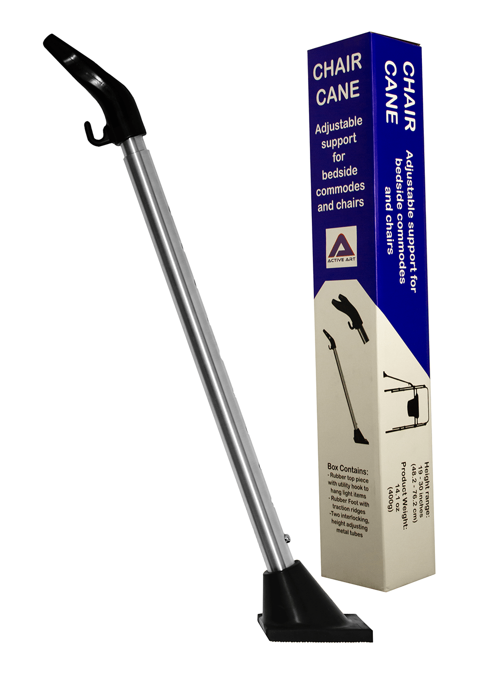
Keep your target audience in mind when developing your packaging. A children’s product packaging should not look like an ergonomic can opener’s packaging. The Chair CaneTM sits between the world’s of furniture and medical devices. The people that are most likely to look at the box are medical professionals, injured people, and family caregivers. For the medical professionals, I wanted something that was quick to inspect and review. For the caregivers and injured, I wanted the box, and the information on it, to be easily understood. That is, not in medical jargon and not in tiny print that requires a magnifying glass. The instructions ended up being a smaller print than I had hoped but that is one of the reasons why I wanted pictures on the box demonstrating the placement and use of the product. There are no language barriers with pictures; no reading skill level considerations with pictures; less issues with vision impairments with pictures. Accessibility is important to consider with all packaging, but anything approaching medical equipment, should make it a priority. Accessibility is also one of the reasons that I have posted instructional and demonstration videos.
The design and color of the packaging are important. If you are selling a new cookie, having it look like something that people are used to getting cookies from, could be essential in the fast scroll world we live. I wanted the Chair Cane box to project stability and trust. I decide on straight, symmetrical lines and a blue/white color scheme. Blue is already associated with the medical realm. Blue tends illicit trust and calmness. If I were looking to create excitement, I would have likely used red, orange, or, perhaps, yellow. If the product was a spa treatment, maybe soft lines with a powder blue. The Active Art logo is blue and red, but that combination would not look right for this product. The colors contrast too much and unsettle the eye. It is why the warning box is in red. I wanted the package coloring and font choices to be simple and functional, no need for flash. I did not need a box that would stand out on a grocery shelf of 30 other items in its category, like a barbeque sauce. The examples below use blue but all use movement in some way. That may be good for for larger brands that sell mobility devices or are trying to convey advancement and forward leaning missions, however, the whole point of the chair cane is that there is no movement. It decreases movement and adds stability. There are no italics or swoosh flares.
2. List what is in the box.
How many parts are included? What are the parts? How much does it weight? How big is it? (including metric measures) If color is important, what colors are included? These listings are regulated for most, if not all products. This seems like it is primarily a consumer protection. What you see is what you get. Amazon regulates product listing photos a little this way. Product photos need to make clear what the actual product being sold includes. Example: The camera tripod does not come with the camera in the photo.
3. Include where it was manufactured and by whom.
Active Art Designs LLC is considered the manufacturer of the Chair Cane. It was made in China but I do not list that company, only the country. I list the contact address for Active Art. If you do not have a separate physical address for your company, get a box (USPS, UPS Store or other).
4. International considerations.
If you intend on selling in other countries, check out packaging requirements in those countries. For example, products sold in Canada should have instructions in French and English. I will be adding, at least, French to my instructions on the next production run.
5. Safety and other things to consider.
People who use certain plastic bags in their packaging need to include warnings. You have likely seen a suffocation warning on a purchase that you have made. Products targeted at children have testing and packaging standards. Food and pharmacy items have extra requirements. Doing a little research before designing packaging can save time and money.


7 thoughts on “5 Essential Ideas for Packaging a New Product”